 Any advertising, web design, or graphic design company can have a hard time picking a color and identifying it. There are around 16 million colors in the RGB digital color model, and it is challenging to achieve a perfect match for any project. That is why it is essential to know the types of combinations and how they are made.
Next, we will talk a little about color harmonies, the techniques to obtain these combinations, and how to use them.
What is Color Harmony and the Color Theory?
Color harmony depends on the color theory, and this theory depends on the following question: What is color?
The color that humans usually see is a light reflection from a surface that is touched by some lighting. This light reflected reaches the human eye, stimulates the cones located in the retina, sends signals to the brain, and allows the reflected color to be interpreted.
We can now define color theory as the set of rules to mix, combine, and select colors to achieve the desired effect. However, this theory also takes care of the color combination to create harmony and a pleasant image for observing that color.
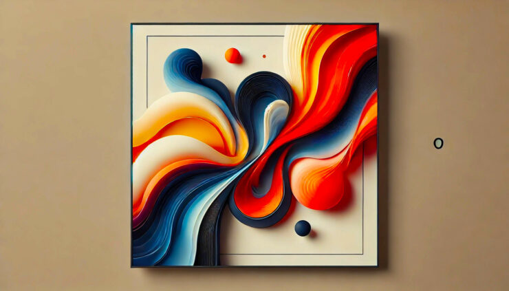
Finally, we can say that the harmony of colors is a perfect balance, proportion, and combination of different colors in a single environment. A basic example of this can be seen in paintings, web pages, brand logos, food packaging, and any artwork or marketing.[/vc_column_text][/vc_column]

Color Harmonies and the Color Wheel
Before knowing the types of color combinations, it is necessary to know the tool that allows creating the Harmony.
The Color Wheel shows all primary colors, their variations according to their transition, and arranged in a circle. There are different color wheels, but usually staggered (separating the colors by blocks) and gradients (the colors separate by their blending) are used. More about Color harmony you can read here.
Taking into account the structure of the Color Wheel, the desired harmony, and some desired colors, it is time to explain the most used color combination techniques:
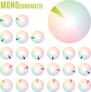
Monochromatic
All the chosen colors must be based on the same color, its different tones throughout its section, and not move to the adjacent colors. It is one of the most harmonious combinations since only the brightness of each tone must be adjusted. However, it can be a bit monotonous and boring.
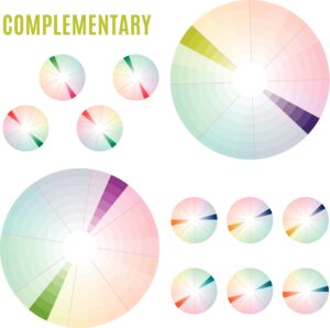
Complementary
The complement will always be the color opposite its position on the Color Wheel. In other words, the color that is precisely in front of the base color. These combinations are the most striking because of the great contrast that this combination creates and the challenge of handling this combination to make any project look great.
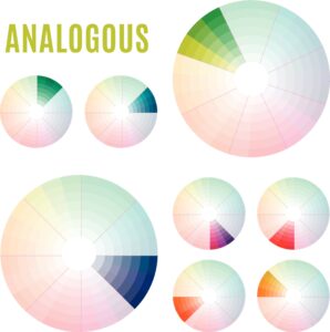
Analogous
This type of combination only uses the colors that are together, one next to the other, and we can use as many as necessary. Although it may seem false, we can find this type of combination, for example, in a sky with clouds. On the other hand, many experts’ recommendation to use this technique is to use one color as the main base and the others to complement it.

Triad
The triad relationship technique consists of taking different three colors placed along with the Color Wheel in the same way.; that is, the same number of colors separates each point. This type of combination can be a bit unusual. However, it never ceases to amaze the excellent contrasts, the subtle balances, and the dominance of one of the colors over the others.
Square Relationship
It is a combination of the Complementary relationship and triad technique because two complements are used, and the same amount of colors separates them. It can form a kind of square if it is joined with straight lines. Working with one complement can be difficult, and working with two may seem impossible, but the result of this combination is one of the best.
Rectangle Relationship
It may be similar to the previous technique, but the difference is that a single color must space the two colors; therefore, the complements are also spaced by a single color. As in the previous one, a rectangle can be obtained if straight lines are drawn between the colors, and it is one of the combinations best seen if they are well elaborated.