
Information about Norway color

Basic facts about this digital color
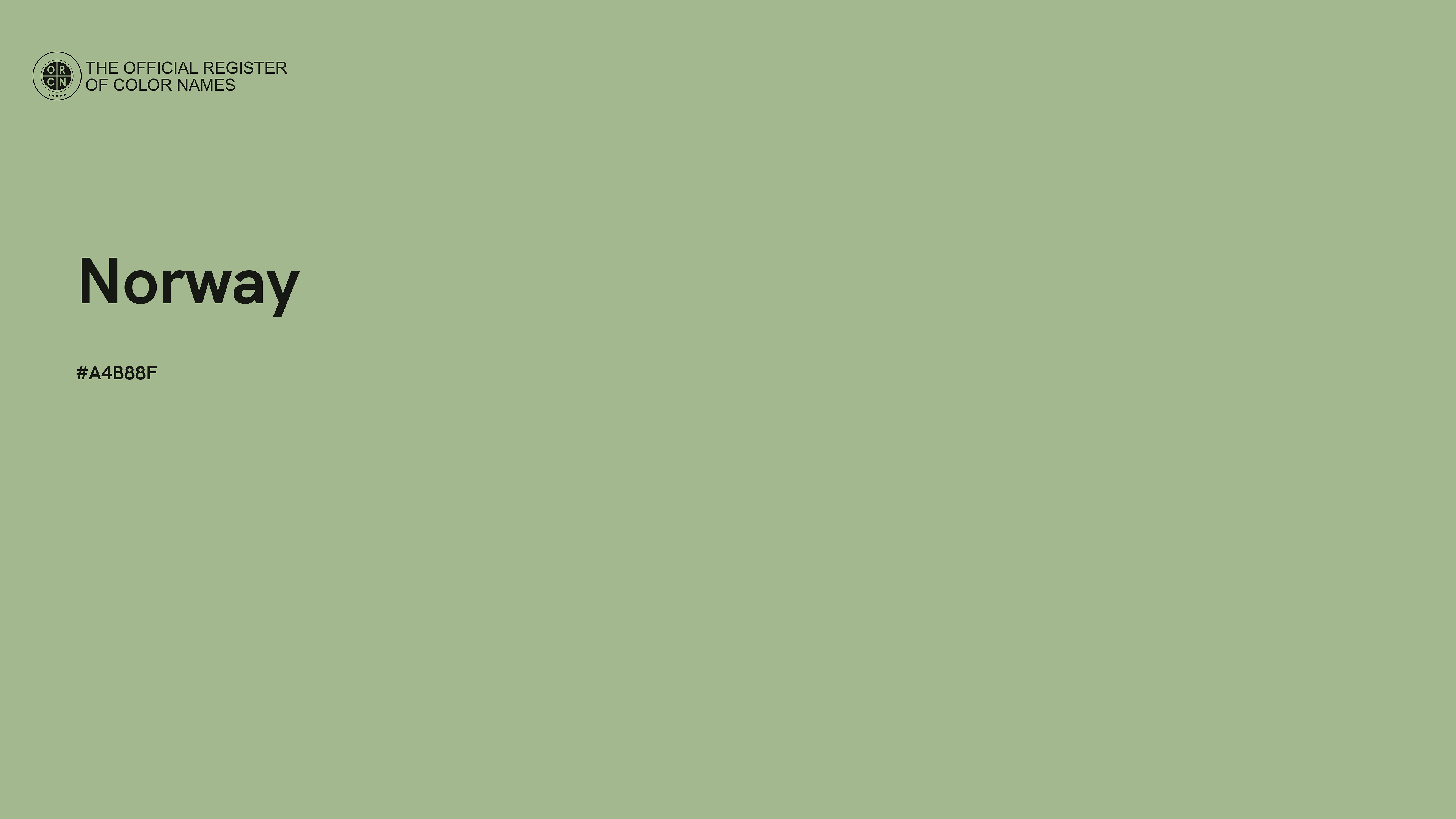
The color #A4B88F reads as a calm, restrained zesty chartreuse and floats near the light end of the scale. Designers typically reach for tones like this for clean interfaces where content needs room to breathe. In The Official Register of Color Names it is almost identical to Whitish Green (#A5BA93). Nearby in the Register you will also find Stun (#A7AC8B) and Spring Rain (#A3BD9C).
In RGB terms — rgb(164, 184, 143) — the green channel does the heavy lifting here. If you plan to put text on a #A4B88F background, choose black — the contrast ratio is 9.8:1 (passing WCAG AAA), while white manages only 2.1:1. This precise shade carries the officially registered name "Norway" in the Register.
Norway color variations
View this color variations of tints, shades, tones and hues.
Norway color tints
Tints look brighter, pastel, and less intense.
Norway color shades
Shades look darker, richer, and more solid.
Norway color tones
Tones looks more sophisticated and complex than base colors.
Norway color hues
A hue refers to the basic neighbors of color and is variation of base color on the color wheel.
Norway color harmonies
Color harmonies are pleasing color schemes created according to their position on a color wheel.
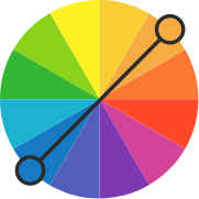
Complementary
Complementary color schemes are made by picking two opposite colors con the color wheel. They appear vibrant near to each other.
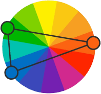
Split complementary
Split complementary schemes are like complementary but they uses two adiacent colors of the complement. They are more flexible than complementary ones.
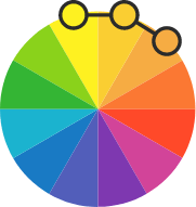
Analogous
Analogous color schemes are made by picking three colors that are next to each other on the color wheel. They are perceived as calm and serene.
Triadic
Triadic color schemes are created by picking three colors equally spaced on the color wheel. They appear quite contrasted and multicolored.

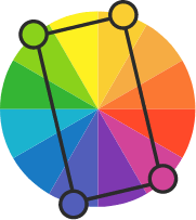
Tetradic
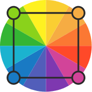
Tetradic color schemes are made form two couples of complementary colors in a rectangular shape on the color wheel.
Square
Square color schemes are like tetradic arranged in a square instead of rectangle. Colors appear even more contrasting.
Alternatives to Norway color
View adjacent and very similar colors.
Nearest named colors to Norway
The closest officially registered color names in the Register, ordered by similarity.

#A5BA93
#A7AC8B
#A3BD9C
#A9AF99
#A9BA9D
#A5A88F
#A1A894
#96AE8D
#ADAD99
#B0AC94
#B1C086
Norway color backgrounds & wallpapers
Download color wallpaper / background for your Desktop PC, Tablet or Mobile phone.


Conversions between color systems and etc.
- HEX#A4B88F
- RGB164, 184, 143
- CMYK8, 0, 16, 28
- CSSrgb(164, 184, 143)
- HSL89°, 22%, 64%
- HSL Precise89.268°, 22.404%, 64.118%
- HSV89°, 22%, 72%
- HSB89°, 22%, 72%
- Normalized R (0.0–1.0)0.643
- Normalized G (0.0–1.0)0.722
- Normalized B (0.0–1.0)0.561
- GLSLvec3(0.643, 0.722, 0.561)
- GLSL with alphavec4(0.643, 0.722, 0.561, 1.000)
- HLSL / Metalfloat3(0.643, 0.722, 0.561)
- Percentage of Red in RGB64.3%
- Percentage of Green in RGB72.2%
- Percentage of Blue in RGB56.1%
- Color FamilyChartreuse
- Saturation FamilyLow Saturation
- Lightness FamilyVery Light
- HEX IDA4B88F
- DECIMAL ID10795151
- Name Length6
- This page visited24 times
- Counting from2025-01-01
